TRAIN DRAMA – the fine art files.
It’s not unusual to be a little suspicious of self-proclaimed “fine art photographers”. It’s also perfectly acceptable to not give the issue much thought. Until, that is, someone contacts you offering the opportunity of hosting an exhibition in an art gallery.
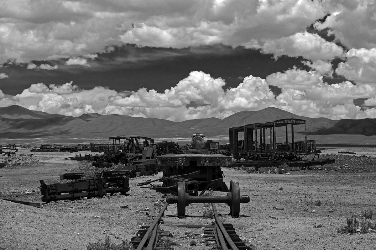
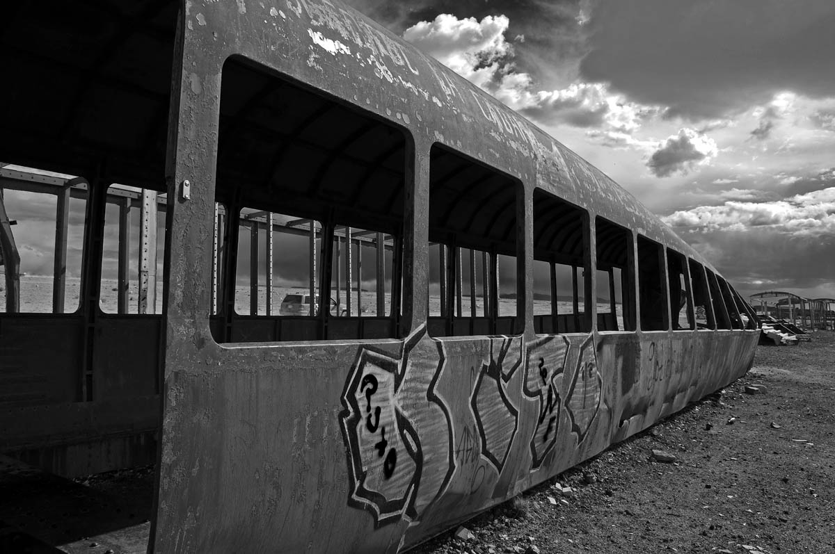
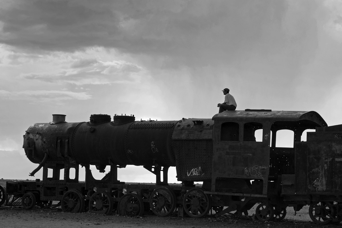
So it was a matter of choosing one strong portfolio, and processing the very best images to give them the “fine art feel”. Below is a selection of dramatic photographs from – yes, again – the incredible train cemetery on the outskirts of Uyuni, Bolivia.

Such is life.
Dead end.

Locomotive skeleton.

Off track.

Out of steam.

Loco no motion.

Let’s do it.
No, let’s wait for the photographer to leave, first.

‘nother couple.
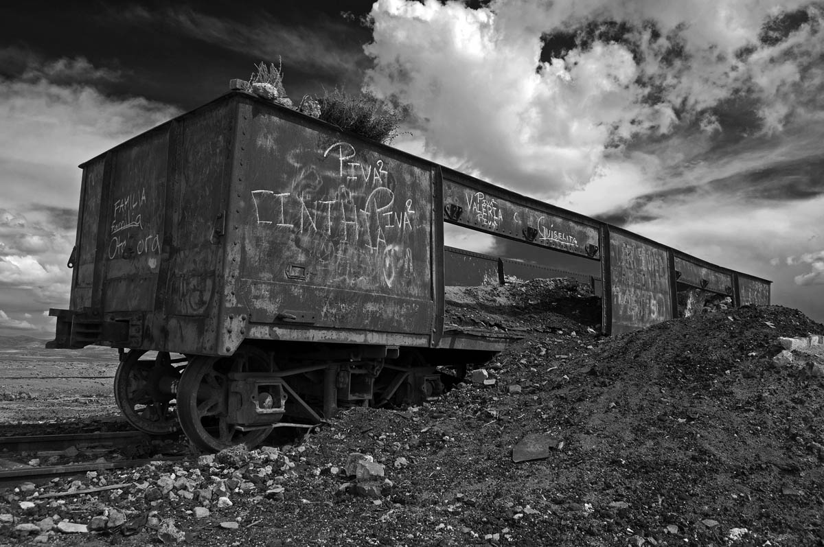
Rusty canvas.

Tipsy?

Things could be worse – it could be raining…
Final destination.
Daydream.
All – no, most – of these photos have been blogged before. So, rather than on the content of the images (or the silly captions!), what i would really enjoy is hearing your opinion on the dramatic, red-filter effect i introduced during processing. Is it dramatic to good effect, or is it simply over the top? How would you react if you walked into an art gallery that was exhibiting these, printed nice and large?
All and any feedback will be dutifully pondered and much appreciated – thanks!
Alessandro Ciapanna

44 Responses to “TRAIN DRAMA – the fine art files.”
Great set, Alessandro!!! I think that the “drama” atmosphere is great for these images and enhance the abandonment feeling of the scenes!!! Well, and printed and in a large format… I think they would be wonderful!!! (my favourite ones: 1 to 4, 8, 11, 13). 😉
Exactly what i was hoping you would say, Santi. Thanks for the encouragement and, especially, for pointing out the stronger shots! 😉
If I walked into an art gallery that was exhibiting these pics, printed nice and large, I most probably found all of them previously sold to very rich people …
And i would be there, and we would drink a glass of wine together and then i would have a special print made of your favorite shot just for you. Gratis, of course… Thanks, buddy!
Great! Done!
I think the filter works really well… the slightly more abstract/dramatic look it gives suits the subject matter perfectly (which is also dramatic and quite abstract/surreal). In other scenes it probably *would* look over the top, but I think it’s right for these! Also I love all the detail and texture in the skies. There are a few where my eye looks at the skies more than the trains, as they hold the higher contrast/interest/detail, but they’re so lovely I’m not sure if it matters (and it also adds to the drama of the whole environment). In ‘Rusty Canvas’, ‘Loco no motion’ and ‘Lets do it’ everything works together beautifully. There’s a really strong style and continuity between them, which is exactly what you want from a set, and both the subject and the treatment is interesting. I would definitely stop to look at them!
Hope this helps 🙂
Justine – thanks.
I couldn’t agree more that the black sky and the wow clouds would be over the top in an ordinary photograph. But, given the wild, untamed, unnatural scenes, i thought the eerie sky actually emphasises the craziness of it all. I am glad you see eye to eye with me and i am grateful for you taking your time to share your analysis with me – grazie! 😉
You are most welcome. Buona fortuna!
I like the red filter effect and the dramatic skies in this set. It brings an extra dimension to the photos and draws the viewer in. A small criticism: if possible, I would open up the shadows on “Such is life”. I’m guessing there is some interesting detail on the train we are missing. A great series, no doubt, though.
Thanks for the compliments and for the tip! If i may ask: which is your favorite tool to “open up the shadows”? That is one department in which i am sorely lacking…
Congratulations. All the best to you.
Let’s wish hard and keep working even harder – thanks!
I think most of what I would say is already above. The very strong contrast is consistent and adds to the drama. I am a big fan of this look but I do agree that a little shadow detail might play well in some of them. Such is Life and Out of Steam spring to mind. How you present them is also crucial so choice of frame / board needs to be carefully considered to set them off to their best. As an exhibition it would deserve to do well but who knows? If I were a buyer and could buy only one I would pick Rusty Canvas. My second choice would be Things could be worse.
Very good pointers, Andrew. I’ll try to get into a frame/border… frame of mind. Your (collective and individual) input is truly precious in singling out the stronger pieces. I had looked at Things could be worse at least fifty times before i ever opened the file for the very first time – three days ago. Crazy landscapes? More like crazy storing of raw files, if you ask me…
Again – thank you.
Great drama and contrast for maximum impact. I like the first and last one best as the sky is softer in contrast to the strong metal forms……….good luck 🙂
I always post my own favorites first and last, so we have similar tastes, it seems. Thanks for the feedback! 😉
🙂
So when is the exhibition?? 🙂 And, the photographs are definitely not “over the top”. The cemetery probably is a lifeless place, but its your vision which has made it so dramatic and full of life!
I’m very glad you liked these, Know-All! Let us, however, not dash into things – we’re still in the if phase. If and when we’ll be in the when zone, all my followers will receive formal invitations… Stay tuned and, if you can, would you please bring a flower to a Hindu temple in the name of my exhibition? Any temple, any god. Can’t hurt, can it? Thanks! 🙂
For you my friend, absolutely!! And let me add, that I am confident that its just a case of when and not if! 🙂 And when it happens, I will be REALLY happy!
LOVE THEM,I NOMINATED YOU
http://yassminelnazer.wordpress.com/2013/04/29/nominated-for-an-award/
Hey! Thanks for the nomination. Hope i deserve it… 😉
sure you do
The red filter gives real drama to the images and I like it. Good luck with the exhibition.
Hey, if this one project doesn’t work out, too bad – the stone is rolling. No stopping it now… 😉
Thanks, my friend.
Absolutely a very fine series. So strong expression!
So glad you think so, Bente (Ms) – your view is highly cherished. A great many thanks for the feedback. 😉
I haven’t seen these before Alessandro…brilliant set, my favourite is ‘dead end’ as it makes me feel like the mess mankind tends to create (and not pick up), has come to an end leaving only the natural beauty of the wilderness beyond to explore, on foot! The filter is a great addition to the already dramatic look of the sky – thanks for sharing again and congrats on the exhibition request…you totally deserve the recognition 🙂
Deb – your comment is highly appreciated. Thanks!
May be something to do with the altitude (4000 or so meters), but when there i really did find myself thinking about the very concepts you name so clearly. Make it, use it, dump it. And only when the mess becomes an embarrassment, does anyone even begin to look for an alternative, cleaner way of doing things.
Fingers crossed, and thanks again! 🙂
The filter effect is great. It adds a little extra drama without being too fake looking.
Thanks and yes, drama but no fakes: the sky was really astounding, on some days…
Gosh, I’d buy everyone if I could afford too. I love the contrast, I love the red filter, I love the strength the red filter lends it.
I am a huge fan of high contrast images. Back in the old days when I printed b&w in the dark room, I would BAM those images.
It always shocked people, they loved them & thought it was because I had a good camera. God, I strongly dislike that saying.
It is NOT the camera, it is the artist that sees through it, like you- Mr. Ciapanna. Mazel Tov on your show. Hugs, amy
Mazel Tov – thanks, Amy!
I wish you had a darkroom now – i can’t begin to imagine what you might come out with… Not that Photoshop isn’t any good, but the feel of real photos on real paper – especially hand-made – can hardly be matched in any other medium…
Shalom!
Shalom, my wonderful friend,
did I mention that I am so proud that someone asked you to do a show? What an honor.
I do wish for a dark room. I remember printing & my father asking me why I wasn’t using the densitometer & I said, “I don’t need to, I’ve got one in my head” He watched as I printed, dodged & burned and nailed it on exposer time. He just walked out of the room.
Please keep the information about the show up to date on your blog. & I would wish that you would send me an invitation (I would frame it!) hugs to you, amy
Excellent photos – O love your work here creating an amazing and dramatic effect.
Ready for exhibition!
Ready i most certainly am – all i hope, is that the exhibition is ready for me…
Thanks for the ongoing support, Truels!
Brilliant photos! The clouds are as substantial as the trains and equally haunting.
I was lucky that the sky really did its very best to add drama to an already unreal landscape. Thanks, poetmcgonagall!
Reblogged this on Beautiful Railway Bridge of the Silvery Tay.
Thanks for the reblog.
Alessandro, I think they are beautifully surreal and dramatic which suits the subject wonderfully.
They will make a very strong exhibition! Congratulations, so well deserved. : )
Thanks, Karen. Such overwhelming feedback is truly encouraging. And a great source of determination: if not in the first or the second gallery, i’ll do my very best so that these photographs find their way onto the wall…
Powerful. The filter works really, really well. 🙂
Thanks, Melissa – so glad you like the effect! 🙂